
Let’s talk about why natural tones for boudoir lingerie— think black, nude, white, and cozy earthy shades — are the true heroes of boudoir photography, and why you might want to skip the bright neons and wild patterns for your big day.
When it comes to planning your boudoir session, choosing the right lingerie is half the magic. Sure, lace, straps, and sultry silhouettes are important… but the color you choose? Oh, that can make or break the final vibe of your photos.
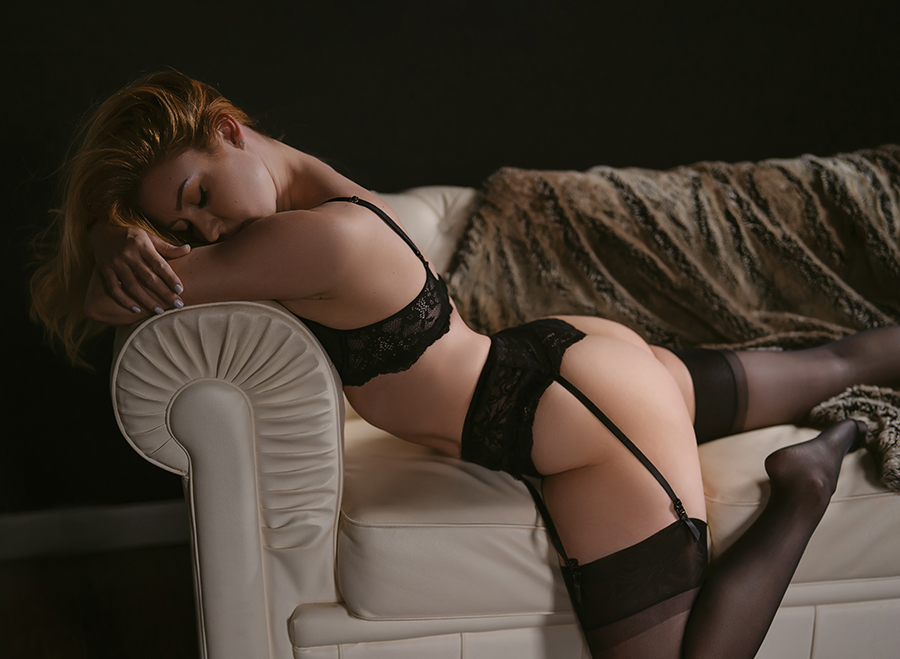
🌚 Black: The Mysterious Icon
Black is timeless. Black is moody. Black is the drama we all deserve.
Whether you’re going for dark academia vibes, romantic shadow play, or old-Hollywood sultry, black lingerie photographs gorgeous on every skin tone. It sculpts, it smooths, and it lets the focus stay right where it should: on YOU.
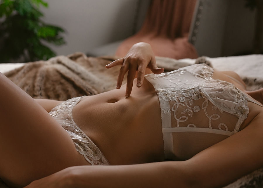
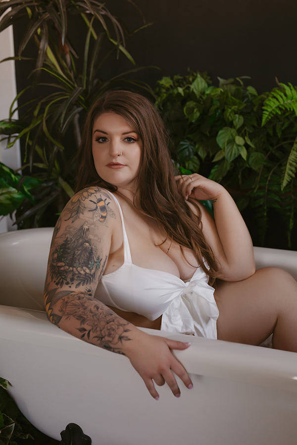
🤍 White: Soft, Clean, Heavenly
White lingerie gives off a dreamy, romantic energy — like a whisper instead of a shout.
In photos, white brings a soft glow and creates beautiful contrast against darker sets, moody backgrounds, or deep shadows. It’s the perfect color for that angelic-but-still-scorching look.
🤎 Nude Tones: The Unsung Heroes
Nude lingerie is like the smooth, perfect base coat for a masterpiece. These tones melt into your skin tone, giving your photos a subtle, elevated vibe without pulling attention away from your expressions, curves, or posing.
Nudes also pair beautifully with detailed robes, jewelry, or layering sets — they let the texture and silhouette do all the talking.

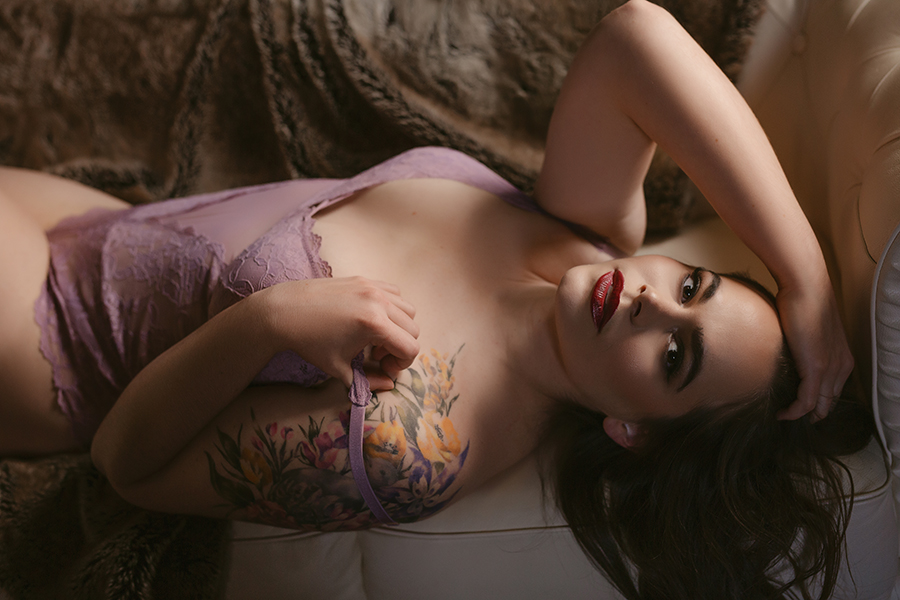
💕 Soft Colors: Pinks, Wines & Blues
If you want a little color, and not just the natural tones for boudoir lingerie, softer shades are your friend. Blush pinks, dusty blues, deep wines, muted mauves — yes please.
These colors photograph beautifully because they add personality without overwhelming the frame. They complement most skin tones, match well with elegant or romantic sets, and keep the focus on you instead of screaming for attention.
🚫 The Case Against Neons & Wild Patterns
We love a fun moment… but boudoir photos are all about elegance, sensuality, and timeless beauty. And for that reason, you’ll want to avoid:
- Bright neon colors (hot pink, neon green, electric yellow… all the highlighters 😅)
- Busy patterns
- Distracting prints
- Lingerie covered in graphics or logos
Why? Because these tend to clash with moody photography, pull the viewer’s eye away from your face and figure, and often reflect oddly in lighting. When you’re investing in a stunning photoshoot, you want the images to feel cohesive, romantic, and high-end — not chaotic.
🎨 Think of It Like Decorating a Room
Your body is the gorgeous centerpiece.
Your lingerie is the décor.
Your photographer is the artist.
If the décor is too loud or busy, it distracts from the masterpiece.
Natural tones create harmony. They flatter. They blend. And they let the story of you come forward.
✨ Final Thoughts
Choosing lingerie colors might seem like a small detail, but it truly shapes the overall vibe of your boudoir gallery. Natural tones like black, nude, and white — plus soft, muted colors — are your secret weapon for photos that feel elegant, timeless, and effortlessly sexy.
Want personalized advice for your session? I’m always happy to help you pick out pieces that photograph beautifully and make you feel like the goddess you are. 💋
